Angular momentum: content composition patterns
Content projection, directive proxies and DI-driven composition, updated for modern Angular

A runnable companion project with interactive demos of each pattern is available on GitHub at yuxblank/angular-content-composition-sample, and can be launched directly in your browser on StackBlitz.
This article explores architectural patterns for user interface development in Angular, from fundamental content projection to inversion-of-control techniques and dynamic component composition.
Directives and Dependency Injection as Composition Primitives
Angular provides two core primitives that make advanced UI composition possible: directives and a hierarchical dependency injection (DI) system tightly integrated with the template engine.
The Role of Directives
Components in Angular are specialized directives that include a template. However, attribute directives offer composition capabilities that components alone cannot:
- Multiple directives can be applied to the same host element to enrich, decorate, or extend its behavior without altering its template.
- Directives are full participants in Angular’s reactive model: they support signal inputs, outputs, host bindings, and queries.
- Each directive instance participates in the host element’s injector and can inject services or ancestor components.
- Directives can be composed onto components declaratively via the Directive Composition API (
hostDirectives).
Template-Driven Dependency Injection
Angular’s dependency injection container operates at both the environment level and the DOM element level. Because every component and directive registers an injector node in the element tree, DI is not limited to application services: it directly models the parent-child relationships of the rendered UI.
The patterns below demonstrate how combining <ng-content>, directives, and element-level DI enables flexible, loosely coupled component architectures.
Content Projection Patterns
The Angular documentation describes <ng-content> as a placeholder that marks where a component’s children should be rendered. While it is often described as inserting content, projection behaves differently from direct DOM insertion.
Understanding content projection
The simplest example:
@Component({
  selector: 'app-content-projection',
  template: `
    <p>This is the internal content of the component</p>
    <ng-content />
  `,
})
export class ContentProjectionComponent {}<app-content-projection>
<div>
<p>i'm getting projected!</p>
</div>
</app-content-projection>The rendered HTML:
<app-content-projection>
  <p>This is the internal content of the component</p>
  <div>
    <p>i'm getting projected!</p>
  </div>
</app-content-projection>
A typical use case is a component with a fixed slot that accepts anything, like a footer that can host an ad.
We’re limited to one slot here, and that’s where the select attribute of <ng-content> comes in handy:
@Component({
  selector: 'app-content-projection',
  template: `
    <p>This is the internal content of the component</p>
    <ng-content />
    <footer>
      <ng-content select="[advertising]" />
    </footer>
  `,
})
export class ContentProjectionComponent {}<app-content-projection>
<div advertising>
<p>ADS</p>
</div>
<div>
<p>i'm getting projected!</p>
</div>
</app-content-projection>The rendered HTML:
<app-content-projection>
  <p>This is the internal content of the component</p>
  <div>
    <p>i'm getting projected!</p>
  </div>
  <footer>
    <div advertising>
      <p>ADS</p>
    </div>
  </footer>
</app-content-projection>
We gained a second slot, advertising, selected with an attribute selector, but things get a little weird for the consumer: the order of the elements in the output isn’t the order they were written in.
That is the first symptom of being projected rather than inserted. The final layout is decided by where the <ng-content> slots sit in the component’s template. A few more rules follow from the same idea:
selectaccepts static CSS selectors (element, attribute, class,:not()), evaluated at compile time. You can’t add, remove or change<ng-content>at runtime.- Content that matches no slot, when there’s no default
<ng-content>, is not rendered at all. - Projected content is always instantiated, even if its
<ng-content>sits inside an@ifthat is false. The content belongs to the consumer’s template, not to yours. If you need to render content conditionally, lazily or more than once, accept an<ng-template>instead (we’ll do exactly that below). - Since Angular 18,
<ng-content>can contain fallback content that renders when nothing is projected into the slot. ngProjectAslets an element (typically an<ng-container>) be projected as if it matched a different selector.
Selective content projection
So far the component knows nothing about what gets projected. With the selective approach we only accept specific elements, so we can interact with them safely from inside the component.
Let’s build a component that accepts a text input and, whenever its value is a swear word, adds the class .swear to its host.
We aren’t targeting a component but a plain HTMLInputElement, so we use a small directive as a typed handle the component can query. The directive also exposes the current value as a signal:
@Directive({
  selector: 'input[type="text"][appInputSelector]',
  host: { '(input)': 'value.set(element.value)' },
})
export class InputSelectorDirective {
  protected readonly element =
    inject<ElementRef<HTMLInputElement>>(ElementRef).nativeElement;
  readonly value = signal(this.element.value);
}
The component projects only elements matching [appInputSelector] and queries the directive with a signal query. No subscriptions or lifecycle hooks needed: the host class is derived state.
const BAD_WORDS = ['bullshit', 'dumb', 'crazy'];

@Component({
  selector: 'app-selective-content-projection',
  template: `<ng-content select="[appInputSelector]" />`,
  host: { '[class.swear]': 'isBadWord()' },
})
export class SelectiveContentProjectionComponent {
  private readonly input = contentChild(InputSelectorDirective);

  protected readonly isBadWord = computed(() =>
    BAD_WORDS.includes(this.input()?.value().trim().toLowerCase() ?? ''),
  );
}
On the consumer side, we mark the input with the directive selector:
<app-selective-content-projection>
  <input type="text" appInputSelector />
</app-selective-content-projection>
Note that select (where content is rendered) and contentChild (what the class can access) are independent mechanisms. Here they target the same elements on purpose. The same technique works with component selectors, making the projectable content both known and interactive.
The Directive Proxy Pattern
Selective projection allows a container component to interact with projected nodes. However, the projected nodes remain in the consumer’s template scope: any attributes, event bindings, or styling attached by the consumer are rendered directly into the container’s DOM.
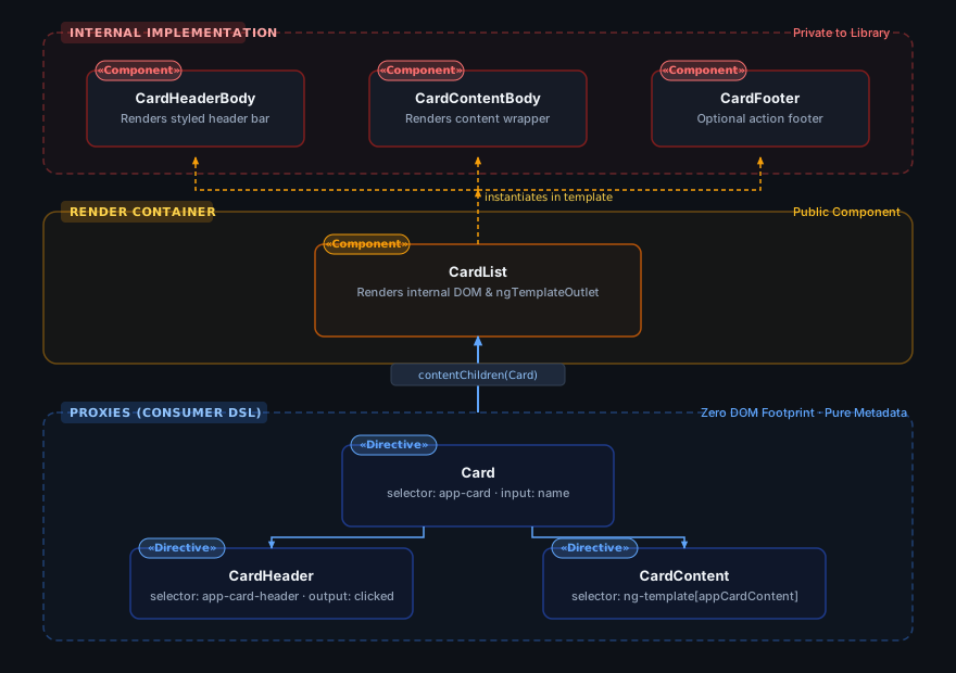
When a library or component requires strict control over rendered markup while retaining a declarative consumer API, the directive proxy pattern provides a clean separation. Directives act as pure metadata proxies: consumers describe structure using markup, but the proxy elements themselves are never attached to the DOM. Instead, the directives expose a declarative DSL that the container component reads to render its own internal component hierarchy.
This pattern is effective when you need to:
- Encapsulate internal DOM structure and styling completely.
- Prevent consumer attributes or event bindings from conflicting with internal listeners.
- Transform declarative markup into a different internal layout.
- Render content lazily or recycle views programmatically via
ng-template.
To illustrate, consider a card list component. We define proxy directives for the card, header, and content. The content directive applies to an ng-template so that the card body can be rendered on demand. CardDirective acts as the root proxy and queries its child proxies:
@Directive({ selector: 'app-card-header' })
export class CardHeaderDirective {
  readonly clicked = output<string>();
}

@Directive({ selector: 'ng-template[appCardContent]' })
export class CardContentDirective {
  readonly template = inject(TemplateRef);
}

@Directive({ selector: 'app-card' })
export class CardDirective {
  readonly name = input.required<string>();
  readonly header = contentChild(CardHeaderDirective);
  readonly content = contentChild(CardContentDirective);
}
Directives can use element selectors like app-card just fine (the router’s <router-outlet> is a directive too). The compiler doesn’t flag the element as unknown, because a directive matches it.
CardListComponent consumes the app-card proxies and renders the actual cards:
@Component({
  selector: 'app-card-list',
  imports: [NgTemplateOutlet],
  template: `
    @for (card of cards(); track card) {
      <div class="card-container">
        <header (click)="card.header()?.clicked?.emit(card.name())">
          {{ card.name() }}
        </header>
        <div>
          <ng-container
            [ngTemplateOutlet]="card.content()?.template ?? noContent"
          />
        </div>
      </div>
    }
    <ng-template #noContent>
      <div>Empty card!</div>
    </ng-template>
  `,
})
export class CardListComponent {
  readonly cards = contentChildren(CardDirective);
}
On the consumer side:
<app-card-list>
  <app-card name="First">
    <app-card-header (clicked)="onCardHeaderClicked($event)" />
    <ng-template appCardContent>
      <div>CARD CONTENT</div>
    </ng-template>
  </app-card>
  <app-card name="Second" />
</app-card-list>
With the directive proxy pattern all the HTML is rendered by our component. There’s no <ng-content> in CardListComponent, so the <app-card> and <app-card-header> elements are instantiated (their directives exist and can be queried) but never attached to the DOM. The only consumer markup that reaches the page is the content of the ng-template, rendered where we put the outlet.
This puts real limits on the consumer side: no binding, attribute or listener on the proxies has any effect unless our implementation wires it up explicitly. That same limitation gives us the strictest encapsulation we can get.
The library author is free to decide how the content is rendered, including splitting it across internal components that are never exposed. With standalone components the public API is whatever your library’s entry point exports. A common convention is to export a ready-to-import array:
// card-list/index.ts (the library's public API)
export {
  CardListComponent,
  CardDirective,
  CardHeaderDirective,
  CardContentDirective,
} from './card-list';

export const CARD_LIST = [
  CardListComponent,
  CardDirective,
  CardHeaderDirective,
  CardContentDirective,
] as const;

// CardHeaderBodyComponent and CardContentBodyComponent are imported by
// CardListComponent internally and never exported.
Consumers just write imports: [CARD_LIST].
Inversion of Control in Template Composition
Dependency injection in Angular directly shapes component composition and the hierarchy of the template tree, extending beyond shared application services. In UI architecture, DI provides:
- Decoupled parent-child communication: Components interact through abstract contracts rather than concrete classes.
- Hierarchical scoping: Subtrees can override configuration or contextual providers without prop drilling.
- Polymorphic queries: Container components can query heterogeneous child elements that satisfy a common token.
Understanding how the injector tree mirrors the DOM is key to unlocking these patterns.
Understanding the element injector tree
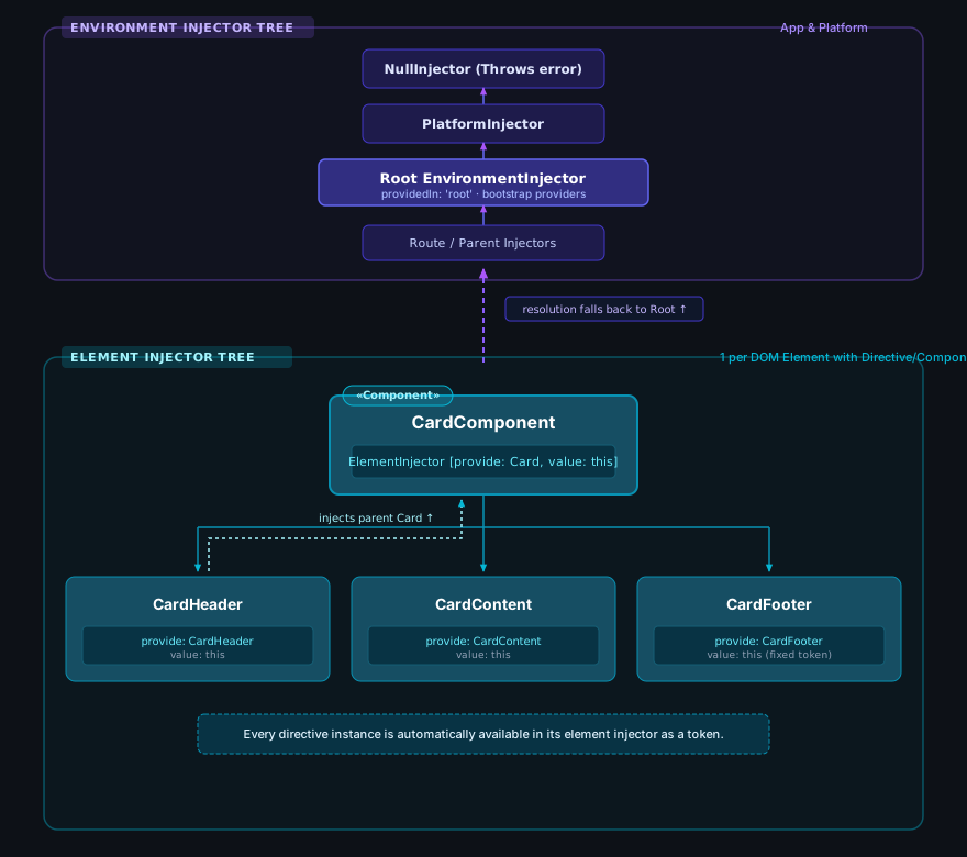
Angular’s DI is a deep topic, so we’ll only scratch the surface. Angular has two injector hierarchies:
- the EnvironmentInjector hierarchy (called
ModuleInjectorin the NgModule days): the root injector, route injectors, and the platform and null injectors above them; - the ElementInjector hierarchy, created for every element that hosts a component or directive.
Simplifying, the element injectors follow the structure of your templates. A directive’s element injector has the element injector of the enclosing element as its parent, which is why a child can inject its ancestors. Resolution walks up the element injectors first and falls back to the environment injectors. Creating views dynamically can break the “mirrors the template” rule on purpose, but it’s a good mental model.
The important detail is that every directive and component instance is itself available for injection on its own element and its descendants, using its class as the token. Whenever you write a selector in a template:
<app-card></app-card>CardComponent becomes a token that resolves to that very instance, for the element and everything nested inside it.
Using lightweight tokens for composition
“Lightweight injection tokens” is a technique documented by Angular mainly for tree-shaking. If a component queries or injects a concrete class, that class is referenced as a value and the bundler must keep it, even when the app never uses it. Querying a small abstract class instead, and having the real component provide itself under it, lets unused implementations be dropped from the bundle.
The same technique goes well beyond bundle size: it’s the backbone of composition built on IoC. The parent depends on a contract, and any number of implementations can plug into it.
Top-down
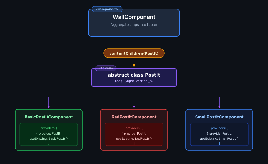
In the top-down approach a component interacts with its content through an abstract type, and each content element provides itself under that type.
As an example, let’s build a WallComponent that accepts post-its in different formats. Every post-it has a list of tags, and the wall shows a footer with the unique tags of all its children.
First the PostIt token. With signal inputs, the contract exposes a signal:
export abstract class PostIt {
  abstract readonly tags: Signal<string[]>;
}
The wall queries its content by the abstract type and derives the tags:
@Component({
  selector: 'app-wall',
  template: `
    <div class="posts"><ng-content /></div>
    <footer>
      <h3>All posts tags</h3>
      <pre>{{ allTags().join(', ') }}</pre>
    </footer>
  `,
})
export class WallComponent {
  private readonly posts = contentChildren(PostIt);

  protected readonly allTags = computed(() => [
    ...new Set(this.posts().flatMap((post) => post.tags())),
  ]);
}
The computed reacts both to post-its being added or removed and to any post-it changing its tags, with no subscriptions to manage.
Now each post-it extends PostIt and provides itself under that token with useExisting. Queries can locate any provider declared in providers (not viewProviders) of a content element, which is what makes this work.
@Component({
  selector: 'app-basic-post-it',
  host: { style: 'background-color: grey' },
  template: `{{ tags().join(', ') }}`,
  providers: [{ provide: PostIt, useExisting: BasicPostItComponent }],
})
export class BasicPostItComponent extends PostIt {
  override readonly tags = input<string[]>([]);
}
And use them inside the wall:
<app-wall>
  <app-basic-post-it [tags]="['A', 'B', 'C']" />
  <app-basic-post-it [tags]="['B', 'C', 'D']" />
  <app-red-post-it [tags]="['10', '20', '30']" />
</app-wall>
We can add as many PostIt implementations as we like, and the wall only ever deals with the abstract type.
Bottom-up
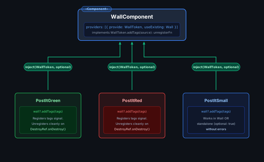
Bottom-up is the reverse: child elements inject an ancestor that provides a given token. Because they depend on the abstract type, children work with any implementation of it.
With the optional flag, a child can also find out whether it’s inside such a container at all and work standalone when it isn’t.
Bottom-up suits nested or recursive structures where children need their parent, and components that share behavior through an abstract class.
Let’s flip the wall example so the post-its talk to the wall. First a token for the wall. Instead of pushing raw tags (which could never be removed), a post-it registers its tag signal and gets back a function to unregister it:
export abstract class WallToken {
  abstract addTags(tags: Signal<string[]>): () => void;
}
The wall provides itself under WallToken and derives the tags from whatever is registered:
@Component({
  selector: 'app-wall',
  template: `
    <div class="posts"><ng-content /></div>
    <footer>
      <h3>All posts tags</h3>
      <pre>{{ allTags().join(', ') }}</pre>
    </footer>
  `,
  providers: [{ provide: WallToken, useExisting: WallComponent }],
})
export class WallComponent extends WallToken {
  private readonly sources = signal<Signal<string[]>[]>([]);

  protected readonly allTags = computed(() => [
    ...new Set(this.sources().flatMap((tags) => tags())),
  ]);

  override addTags(tags: Signal<string[]>): () => void {
    this.sources.update((sources) => [...sources, tags]);
    return () =>
      this.sources.update((sources) => sources.filter((s) => s !== tags));
  }
}
The post-it injects the token optionally, so it works both inside any WallToken implementation and on its own, and it unregisters when destroyed:
@Component({
  selector: 'app-post-it',
  template: `{{ tags().join(', ') }}`,
})
export class PostItComponent {
  readonly tags = input<string[]>([]);

  constructor() {
    const wall = inject(WallToken, { optional: true });
    if (wall) {
      inject(DestroyRef).onDestroy(wall.addTags(this.tags));
    }
  }
}
Configuration-Driven Composition vs. Template Decomposition
A common alternative to declarative template composition is passing a configuration object to a component. Because Angular compiles templates ahead of time into direct DOM instructions rather than evaluating an arbitrary runtime virtual DOM, a static configuration object can only select among elements and variants that the template already anticipates.
Examining how configuration objects scale helps clarify when to use hierarchical DI tokens and when to decompose components through template projection.
Managing Component Complexity
UI components typically expose customization points through inputs for data and outputs for events:
<my-super-datepicker
  dateFormat="dd/MM/yyyy"
  (dateSelected)="onDateSelected($event)"
/>@Component({
selector: 'my-super-datepicker',
template: `...`,
})
export class SuperDatePickerComponent {
readonly dateFormat = input('yyyy-MM-dd');
readonly dateSelected = output<Date>();
}The trouble starts when your component has a lot of options. Say our super datepicker is highly configurable:
<my-super-datepicker
  dateFormat="dd/MM/yyyy"
  [minDate]="minDate"
  [maxDate]="maxDate"
  [focusOnClick]="true"
  [enableKeyboard]="true"
  [enableWeekends]="false"
  disabledDaysClass="disabled-day"
  dropDownPosition="top"
  [showConfirmButton]="true"
  [allowSelectTime]="false"
  [disabled]="isDisabled"
  [recommendedDays]="['Monday', 'Friday']"
  [recommendedMonths]="['March', 'April']"
  [disabledRanges]="disabledRanges"
  [disabledWhen]="disabledWhenFn"
  (dateSelected)="onDateSelected($event)"
/>
As the list of configurable options expands, managing individual input bindings becomes unwieldy and error-prone.
The standard refactoring is to separate configuration properties into dedicated interfaces, distinguishing global defaults from instance-specific overrides:
// general config: sensible to set app-wide
export interface DatePickerGeneralConfig {
  dateFormat: string;
  focusOnClick: boolean;
  enableKeyboard: boolean;
  dropDownPosition: 'top' | 'bottom';
  showConfirmButton: boolean;
  allowSelectTime: boolean;
}

// instance config: only makes sense per instance
export interface DatePickerConfig extends DatePickerGeneralConfig {
  minDate?: Date;
  maxDate?: Date;
  enableWeekends?: boolean;
  recommendedDays?: string[];
  disabledRanges?: { from: Date; to: Date }[];
  disabledWhen?: (date: Date) => boolean;
}
Now we use the injector to provide a default general configuration that users can override globally or for part of the tree. The token carries its own default, and a provide* function, the idiomatic shape for configuration in standalone Angular, merges overrides on top of whatever is configured above:
export const DEFAULT_DATEPICKER_CONFIG: DatePickerGeneralConfig = {
  dateFormat: 'yyyy-MM-dd',
  focusOnClick: true,
  enableKeyboard: true,
  dropDownPosition: 'bottom',
  showConfirmButton: false,
  allowSelectTime: false,
};

export const DATEPICKER_CONFIG = new InjectionToken<DatePickerGeneralConfig>(
  'DATEPICKER_CONFIG',
  {
    providedIn: 'root',
    factory: () => DEFAULT_DATEPICKER_CONFIG,
  },
);

export function provideDatePickerConfig(
  config: Partial<DatePickerGeneralConfig>,
): Provider {
  return {
    provide: DATEPICKER_CONFIG,
    useFactory: () => ({
      ...(inject(DATEPICKER_CONFIG, { skipSelf: true, optional: true }) ??
        DEFAULT_DATEPICKER_CONFIG),
      ...config,
    }),
  };
}
provideDatePickerConfig({ dateFormat: 'dd/MM/yyyy' }) goes in bootstrapApplication for the whole app, and the same call in a route’s or component’s providers refines it for that subtree.
The component merges the injected defaults with the instance inputs. Since everything is a signal, the resolved configuration is a single computed, without mutable state or input setters:
@Component({
  selector: 'my-super-datepicker',
  template: `...`,
})
export class SuperDatePickerComponent {
  readonly config = input<Partial<DatePickerConfig>>({});
  readonly dateFormat = input<string>();
  readonly dateSelected = output<Date>();

  private readonly defaults = inject(DATEPICKER_CONFIG);

  protected readonly resolvedConfig = computed<DatePickerConfig>(() => {
    const dateFormat = this.dateFormat();
    return {
      ...this.defaults,
      ...this.config(),
      ...(dateFormat ? { dateFormat } : {}),
    };
  });
}
From the user’s perspective:
<my-super-datepicker
  [config]="datePickerConfig"
  dateFormat="MM.dd.yyyy"
  (dateSelected)="onDateSelected($event)"
/>
That handles the growing complexity, but how does the configuration approach relate to content composition?
Using content projection
As we’ve seen, content composition lets us express any structure we want. With selectors, proxies and lightweight tokens we can replace the configuration object entirely, because the elements our component supports are the configuration tree.
Let’s turn the super datepicker into a composed element:
<my-super-datepicker-input [picker]="dp" />

<my-bottom-super-datepicker #dp (dateSelected)="onDateSelected($event)">
  <my-super-datepicker-time-selector min="08" max="22" />
  <button mySuperDatePickerConfirm>OK</button>
</my-bottom-super-datepicker>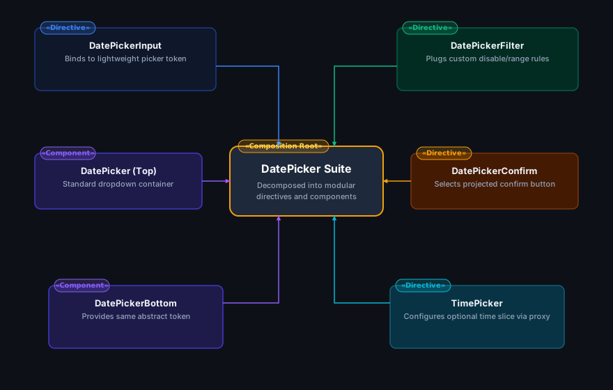
This combines several of the techniques above:
- The input is now a separate element. Its
pickerinput is typed with a lightweight abstract datepicker token, so it works with any implementation, and the'top' | 'bottom'option became two different components. - Instead of a
showConfirmButtonflag, the consumer projects a button, and a directive selector lets the datepicker detect and wire it up. - The time selector uses the directive proxy pattern: the consumer declares it and the datepicker renders it.
I won’t go through the full implementation, but the advantages should be clear:
- the configuration is expressed as markup, which allows far more customization;
- the pieces are split up and abstracted, so different implementations can be supported through lightweight tokens (the datepicker);
- implementations stay encapsulated in their own elements (the time selector).
Trade-Offs of Template Decomposition
While composing elements in markup maximizes flexibility and encapsulation, it introduces specific architectural trade-offs:
- API Surface: It requires designing and maintaining coordinated suites of directives, abstract tokens, and selectors.
- Direct Template Access: It requires the consuming developer to directly author the markup where the composition takes place.
In pluggable systems—such as micro-frontends or modular plugin architectures—this assumption no longer holds. A host application defines layout shells and extension points, while independent feature modules supply domain-specific views without modifying the host templates directly.
Pluggable Feature Architectures
Consider an application structured as a host shell with domain plugins (for instance, an e-commerce platform hosting Clothes, Music, and Electronics features). The host provides shared layout, navigation, and a search header, while each feature domain contributes its own contextual filter controls:
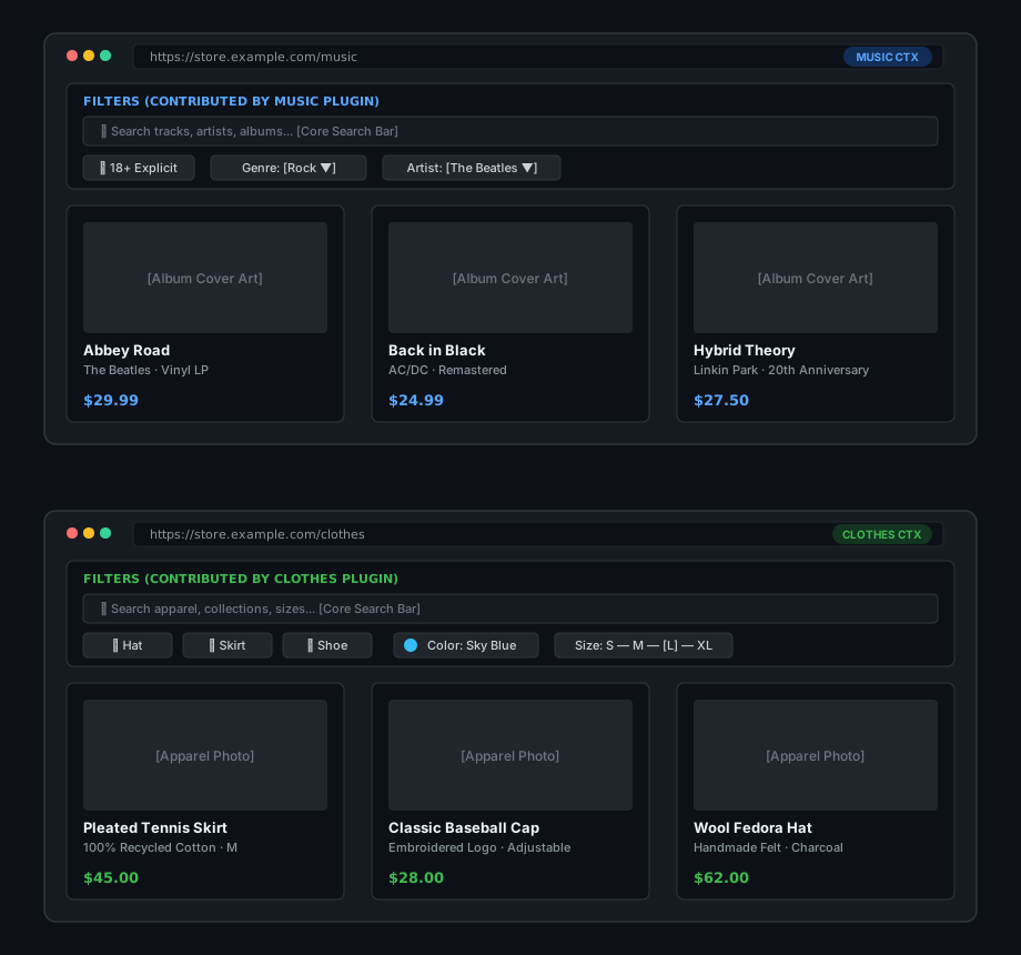
A first approach is a configuration pattern: features supply filter configurations, and the core application renders them. We define a filter type, a multi-provider token and a service that selects the filters for the current context:
export interface FilterConfig<T = unknown> {
  ctx: string;
  type: 'toggle' | 'select' | 'color' | 'range';
  name: string;
  position: number;
  invalidWhen?: (value: T) => boolean;
  hiddenWhen?: (value: T) => boolean;
  incompatibleWith?: (other: FilterConfig, value: T) => boolean;
}

export const FILTERS = new InjectionToken<FilterConfig[]>('FILTERS');

export function provideFilters(...filters: FilterConfig[]): Provider[] {
  return filters.map((filter) => ({
    provide: FILTERS,
    useValue: filter,
    multi: true,
  }));
}

@Injectable({ providedIn: 'root' })
export class FilterService {
  private readonly filters = inject(FILTERS, { optional: true }) ?? [];
  private readonly appContext = inject(AppContextService);

  readonly contextFilters = computed(() =>
    this.filters
      .filter((filter) => filter.ctx === this.appContext.current())
      .sort((a, b) => a.position - b.position),
  );
}
The core filter component reads the available configurations and renders the matching UI elements:
@Component({
  selector: 'app-filters',
  imports: [
    FilterSearchBarComponent,
    ToggleFilterComponent,
    ColorFilterComponent,
    SelectFilterComponent,
  ],
  template: `
    <app-filter-search-bar />
    @for (filter of filters(); track filter.name) {
      @switch (filter.type) {
        @case ('toggle') {
          <app-toggle-filter [filter]="filter" />
        }
        @case ('color') {
          <app-color-filter [filter]="filter" />
        }
        @default {
          <app-select-filter [filter]="filter" />
        }
      }
    }
  `,
})
export class FiltersComponent {
  protected readonly filters = inject(FilterService).contextFilters;
}
A feature only has to provide its filter configuration:
provideFilters(
  { ctx: 'clothes', type: 'toggle', name: 'hat', position: 1 },
  {
    ctx: 'clothes',
    type: 'color',
    name: 'color',
    position: 2,
    invalidWhen: (value) => isNotAvailable(value),
  },
);
Watch out for injector scope. Multi providers are collected per injector. If a feature registers its filters in a lazy route’s
providers, they live in that route’s childEnvironmentInjector, and aprovidedIn: 'root'service will never see them. Either register plugin providers where the core reads them (for example inbootstrapApplication) or resolve them from an injector below the route.
With this pattern the features supply the configuration of every filter, but:
- all the UI elements are defined in the core app, so domain concepts have leaked into the core;
- if a new feature needs a new kind of filter UI, the core has to change first to support it;
- the core interface has to define callbacks, DSL expressions or whatever else is needed to evaluate logic supplied by the features.
Using dependency injection and dynamic components
By combining DI with dynamic components, the configuration can carry what to render rather than how to configure what the core renders. This enables plenty of use cases, from simple hooks for dynamic content (ads, banners) to features contributing whole pieces of UI with their own behavior.
Let’s re-engineer the previous example. A plugin now has only a context key and a component type, and the core renders the component registered for the current context:
export interface FilterPlugin {
  ctx: string;
  component: Type<unknown>;
}

export const FILTER_PLUGINS = new InjectionToken<FilterPlugin[]>(
  'FILTER_PLUGINS',
);

export function provideFilterPlugin(plugin: FilterPlugin): Provider {
  return { provide: FILTER_PLUGINS, useValue: plugin, multi: true };
}

@Component({
  selector: 'app-filters',
  imports: [NgComponentOutlet, FilterSearchBarComponent],
  template: `
    <app-filter-search-bar />
    @if (activeFilter(); as filter) {
      <ng-container *ngComponentOutlet="filter.component" />
    }
  `,
})
export class FiltersComponent {
  private readonly plugins = inject(FILTER_PLUGINS, { optional: true }) ?? [];
  private readonly appContext = inject(AppContextService);

  protected readonly activeFilter = computed(() =>
    this.plugins.find((plugin) => plugin.ctx === this.appContext.current()),
  );
}
NgComponentOutlet also accepts inputs and a custom injector. If you need more control, ViewContainerRef.createComponent takes the component type directly. Since Angular 20 it can also bind inputs and outputs declaratively:
outlet.createComponent(plugin.component, {
  bindings: [
    inputBinding('query', this.query),
    outputBinding<string>('changed', (value) => this.onFilterChanged(value)),
  ],
});
Each feature now ships its own filter UI for its context:
@Component({
  selector: 'app-clothes-filters',
  imports: [CheckboxFilterComponent, ColorFilterComponent],
  template: `
    <app-checkbox-filter />
    <app-color-filter />
  `,
})
export class ClothesFiltersComponent {}

// in the feature's providers
provideFilterPlugin({ ctx: 'clothes', component: ClothesFiltersComponent });
No ComponentFactoryResolver, no entryComponents: both were needed with the pre-Ivy compiler and are long gone.
With this approach:
- filter UIs are provided by features, independently of the core app;
- any new feature can bring its own UI elements;
- filtering logic stays encapsulated in the feature, which can still reach the core through injection or services.
Conclusion
Each pattern covered in this article addresses specific architectural requirements and trade-offs:
| Pattern | Primary Use Case | Key Primitives |
|---|---|---|
| Content Projection | Flexible component layout slots | <ng-content>, select attribute |
| Selective Projection | Type-safe interaction with projected nodes | Directive selectors, contentChild |
| Directive Proxy | Strict encapsulation with declarative markup DSL | Directives on ng-template, ngTemplateOutlet |
| Top-Down (Tokens) | Polymorphic child collections | Abstract class token, contentChildren, useExisting |
| Bottom-Up (IoC) | Context-aware child components | Parent token injection, DestroyRef.onDestroy |
| Configuration Cascades | Scalable application and subtree defaults | InjectionToken, provide*() factory functions |
| Dynamic Components | Pluggable, decoupled feature contributions | *ngComponentOutlet, ViewContainerRef.createComponent |
Modern Angular primitives—standalone components, signal queries, inputs, and built-in control flow—eliminate manual lifecycle subscriptions and reduce boilerplate. The underlying architectural capabilities, however, remain rooted in directives, content queries, and hierarchical dependency injection.